Squarespace for Equestrian Brands: SEO, Strategy & Growth in 2026
Updated: January2026
Choosing a website platform often feels more complex than it should. Many equestrian businesses have wrestled with WordPress installations, endless plugin updates, confusing admin panels, and the frustration of paying developers for simple fixes. This was our experience too, until we decided to transition to Squarespace. That shift has allowed us to focus less on technical issues and more on building websites that actually deliver brand consistency, discoverability, and measurable return on investment.
Squarespace continues to prove its worth in 2026, particularly for equestrian businesses and athletes who need a digital foundation that not only looks good but also works as a living, breathing part of their marketing strategy. For us, it was never just about having a platform to publish content, it was about choosing a system that would support branding, enable visibility in search, and give us the agility to adapt to a digital landscape where consumer expectations evolve rapidly.
Branding Consistency as the Cornerstone of Digital Identity
In equestrian marketing, branding goes far beyond a logo. It is about consistency in voice, imagery, values, and how your business is perceived at every touchpoint. A website sits at the centre of this ecosystem. While social media may amplify your story, it is your website that houses it, anchors it, and ensures that every interaction ties back to a coherent brand identity. Squarespace is especially powerful in this regard because it allows businesses to translate their offline personality into an online experience that feels authentic and recognisable.
Brand identity is built not by sporadic design changes but by repetition, cohesion, and reliability
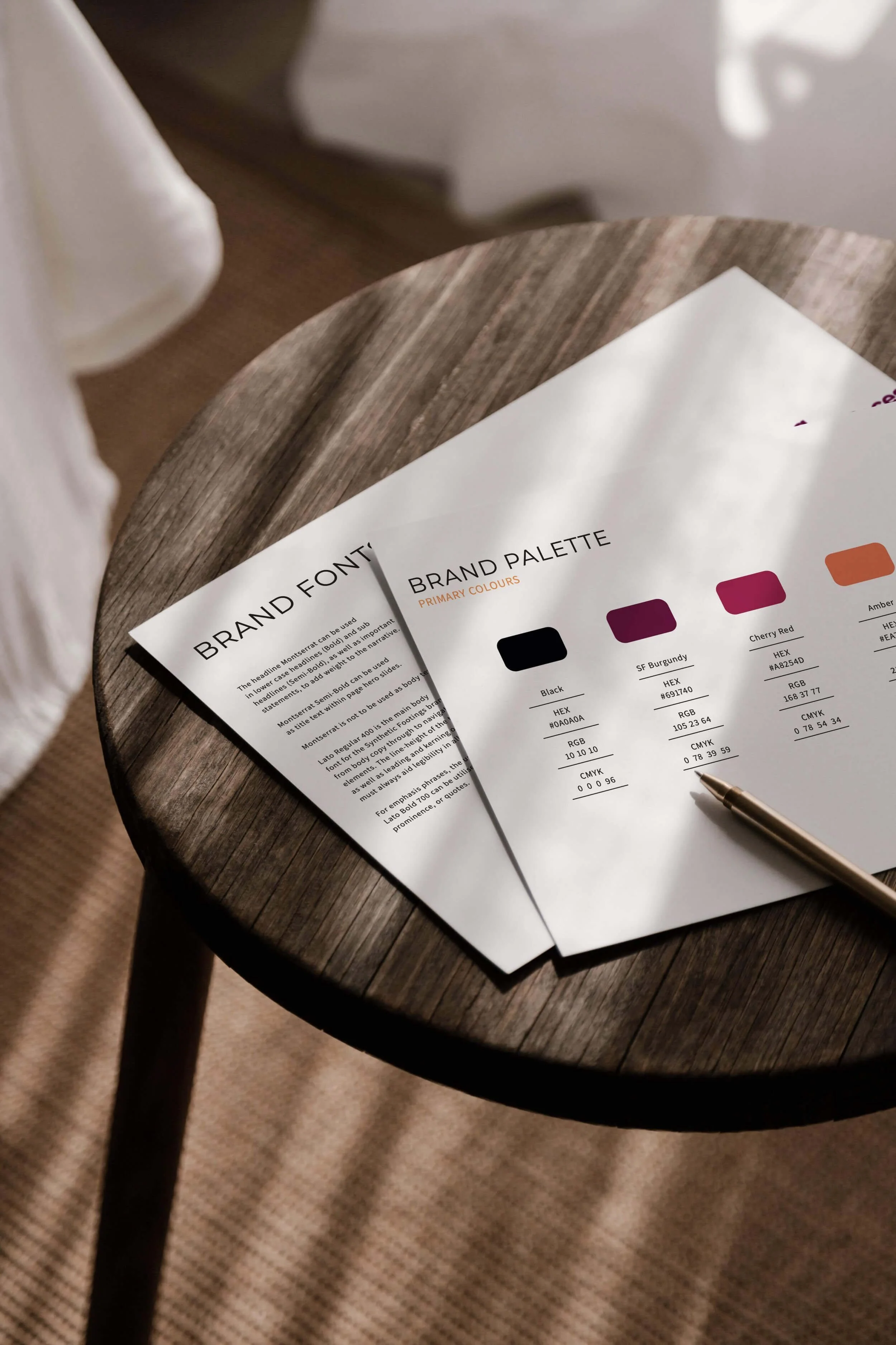
The ability to control fonts, colours, layouts, and imagery through Squarespace’s design tools means that your brand’s tone is not compromised by technical hurdles. Rather than struggling with a clunky interface or relying on a developer to make visual adjustments, you can maintain brand consistency yourself. This is vital because brand identity is built not by sporadic design changes but by repetition, cohesion, and reliability. Customers, sponsors, and partners develop trust when they encounter the same quality and visual language across multiple channels, and your website is where that impression crystallises.
Consistency across platforms also boosts discoverability. Google increasingly rewards businesses that present coherent branding signals, not just in their content but in how they are structured online. A Squarespace site, when built correctly, ensures these branding elements are uniform and optimised. It allows for easy integration of imagery and storytelling, creating a seamless extension of your equestrian brand. For a deeper dive into how branding drives differentiation, we’ve explored this topic further in “Equestrian Branding in the Digital Age: How to Stand Out Beyond Logos”. Together, strong branding and a platform that supports it act as the backbone of long-term visibility.
Discoverability and SEO as Strategic Growth Drivers
Having a beautiful website is meaningless if it cannot be found. This is where Squarespace excels, particularly for businesses without a dedicated technical team. While WordPress often relies on a patchwork of plugins to handle SEO, Squarespace includes robust, user-friendly SEO functionality as part of its platform. From editable page titles and descriptions to automated clean URL structures and mobile optimisation, it removes the barriers that typically keep businesses from appearing in search results.
Yet SEO in 2026 is no longer just about keywords. It is about creating an ecosystem of discoverability where your website speaks the same language as your audience. Squarespace makes this simpler by supporting integrations with tools such as Google Analytics and Search Console, allowing businesses to track exactly how their pages are performing and where improvements can be made. By monitoring dwell time, bounce rates, and conversions, equestrian businesses can understand which parts of their website truly resonate and which require refinement.
SEO in the Age of AI Search
In 2025, Google significantly expanded the use of AI-generated summaries within search results. These summaries are designed to answer user questions directly on Google, often before a user clicks through to a website. As a result, search behaviour has changed. Users are now less likely to click traditional search results when an AI summary appears, particularly for informational queries.
This does not mean SEO has become less important. It means visibility now operates differently. Being trusted, clearly structured, and easy for AI systems to interpret has become a critical part of search presence. Websites that communicate expertise, clarity, and relevance are more likely to be referenced or surfaced by AI summaries, even when overall click-through rates decline.
Squarespace supports this shift well. Clean page structures, consistent headings, clear metadata, and fast-loading pages all help ensure that your content can be accurately interpreted by both human users and AI-driven search systems. In a landscape where visibility increasingly happens before a click, structure and clarity matter more than ever.
Data-driven optimisation is where Squarespace becomes more than a design platform, it becomes a growth engine. Because the system is intuitive, you don’t waste hours learning how to use SEO plugins or worrying about technical incompatibilities. Instead, you can spend your time interpreting the analytics and applying the findings to refine your content strategy. This is where evergreen content and analytics meet. Articles and resources that stand the test of time can be constantly monitored, refreshed, and improved to strengthen visibility and relevance. When paired with AI-powered insight tools that identify emerging search trends and consumer behaviour shifts, businesses can proactively adapt their content to remain competitive.
Rethinking SEO Metrics for 2026
As AI summaries increasingly satisfy user intent directly within search results, traditional metrics such as click-through rate and organic sessions no longer tell the full story. Visibility now also includes impressions, brand mentions, and whether your content is being surfaced, referenced, or reinforced within AI-generated answers.
For equestrian businesses and athletes, this means SEO success should be evaluated alongside downstream outcomes. Enquiries, bookings, sponsorship conversations, and brand recognition are increasingly important indicators of whether a website is performing its role within the wider marketing ecosystem.
Discoverability also ties directly to commercial outcomes. For equestrian athletes and businesses, sponsors want measurable exposure. Brands increasingly ask not just for social media impressions but for demonstrable data that shows sustained visibility through websites and search presence. By using Squarespace’s built-in SEO and analytics capabilities, you can present credible metrics to partners, including page visits, geographic reach, and referral sources, that go far beyond what social platforms provide. This positions your website as a strategic sponsorship asset rather than a static brochure.
Ease of Use, Reliability, and Peace of Mind
Hosting and security are included within Squarespace, updates are automatic, and the system is designed to protect your site without the need for third-party add-ons
What truly sets Squarespace apart from platforms like WordPress is the ease of use combined with reliability. The interface is clean and intuitive, meaning that equestrian professionals without technical experience can manage their own sites confidently. Updating pages, adding new services, or publishing content can be done in minutes, without the constant worry that an update will break functionality.
This simplicity extends to hosting, maintenance, and security. On WordPress, every update can trigger a chain reaction. Plugins stop working, layouts collapse, or worse, the site becomes vulnerable to attacks. Many equestrian businesses found themselves paying developers just to keep the lights on. With Squarespace, hosting and security are included, updates are automatic, and the system is designed to protect your site without the need for third-party add-ons. What you gain is not just technical efficiency but peace of mind. You know your website will remain secure, visible, and functioning no matter how technology evolves in the background.
For equestrian professionals who already juggle demanding schedules, this reliability is not a small thing. It means you can spend your time building your brand story, engaging audiences, and refining your marketing strategy instead of firefighting technical issues. In a competitive industry, that reclaimed time is a major strategic advantage.
Squarespace as a Platform for Long-Term Strategic Growth
When we talk about digital growth, it is easy to focus solely on design or SEO. But the real power of Squarespace lies in how it allows equestrian businesses to integrate all these elements, branding, discoverability, usability, into a single coherent platform that supports long-term strategy. By removing the barriers of complexity, it gives you the freedom to focus on the parts of marketing that actually drive return. Creating content, building relationships, and refining your message.
For many equestrian businesses, growth is about agility. Seasons change, competitions come and go, regulations shift, and consumer behaviours evolve. Squarespace’s agility means that your website can keep pace. You can launch new services quickly, update sponsors and partners instantly, or pivot messaging as needed, all without waiting weeks for a developer. This responsiveness builds trust, because audiences notice when a website is current, functional, and reflective of real-time business activity.
Strategic growth also comes from aligning your website with your wider marketing ecosystem. Social media campaigns, email marketing, and paid advertising are all amplified when your website is the foundation. Squarespace integrates seamlessly with these channels, allowing data to flow across platforms and providing you with a clearer picture of customer journeys. When you understand how a visitor moves from an Instagram Story to a landing page to a contact form, you gain the insights necessary to refine campaigns and maximise ROI.
Ultimately, a website should not just exist. It should perform. Squarespace gives equestrian businesses the ability to build sites that are not only visually strong but strategically valuable, connecting branding, analytics, and long-term discoverability. It allows you to claim digital real estate that grows in value over time, ensuring your brand is not just seen but remembered.
Strategic growth comes from aligning your website with your wider marketing ecosystem
Squarespace for E-Commerce and Comparison with Other CMS Platforms
Another area where Squarespace has grown considerably is e-commerce. For equestrian businesses selling tack, apparel, training services, or event tickets, the platform offers a streamlined online store that is easy to manage without sacrificing design or functionality. Inventory management, secure payment gateways, and integrations with shipping tools are built into the system, giving even small businesses the ability to sell directly from their website without the complexity often associated with third-party plugins.
When compared with Shopify, Squarespace holds its own as an all-in-one solution. Shopify remains the stronger option for businesses with very large inventories or highly complex product structures, but Squarespace offers a more design-driven, user-friendly alternative for those who want a beautiful website and a store that functions seamlessly alongside their content and branding. For many equestrian businesses, the priority is not running thousands of SKUs but delivering a polished, professional customer experience. Squarespace makes that balance possible.
It is also worth noting that while we often recommend Squarespace for its balance of design, branding consistency, and integrated functionality, we do not rely on it exclusively. Our team has extensive experience with WordPress, Shopify, and other CMS platforms, and we select the solution best suited to each client’s needs. In some cases, Shopify’s advanced e-commerce tools or WordPress’s extensive plugin ecosystem are the right choice. In others, Squarespace provides the ideal blend of simplicity and strategic capability. What matters most is aligning the platform with the brand’s objectives, resources, and long-term growth strategy.
Our Final Thoughts
In 2026, choosing a website platform is one of the most strategic decisions an equestrian business or athlete can make. Squarespace provides a combination of branding consistency, discoverability through SEO, user-friendly design, and reliable performance that makes it uniquely suited to the demands of modern equestrian marketing. Unlike platforms that require constant maintenance and technical oversight, it empowers businesses to focus on growth, storytelling, and strategy.
Your website should be more than a static presence. It should be the living, breathing centre of your brand identity. With Squarespace, you have the tools not just to maintain that presence, but to make it a driver of long-term ROI.


